
Time Frame: 2 weeks
Tools: Google, Google Forms, Google Sheets, Trello, Omnigraffle, Sketch, Invision, Hype, Keynote
My Role: UX Designer, UI Designer, User Researcher, Interaction Designer, Project Manager
Platform: Mobile App
Business Goals
During our initial brainstorming session for Movie Foodie, My teammates Ning and Rik and had some hesitation on developing the concept further. In a world filled with apps that make life easier and more efficient, Movie Foodie does not help or solve any user problems. While it’s fun to combine the movie and food experience together, was that enough to turn it into an app? We decided it was worthwhile to find out.
Research
“When its a movie I really want to watch, I try to have a really good meal to go along with it.”- Dane A.
To find out the cooking and movie consumption habits of users, we sent out an online survey. We received 33 surveys back. 100% of the people watched movies at home. While 97% of people prepare meals at home, only 18.2% of people purchased grocery online. There was an opportunity for Fresh Direct to capture more of that market.
Affinity Diagram
Taking the user interviews responses, we began to look at different behaviors of users. Interviewees watch movies at home in three ways: alone, group or with a significant other. When they do eat food while watching a movie, they are undecided, have a vague idea of what they want, or know exactly what they want.

Comparative analysis
Apps like All recipes, Food Network, All The Cooks, and Epicurious were analyzed to look at what features were successful and what can be taken out while still keeping the information streamlined. The user flow for all recipe apps from home page to recipe page was efficient, all done in two clicks. Maintaining the same navigation efficiency despite having a movie match feature in our app would be very important. After we looked at different apps and their features, we came up with categories for features ranging for "must haves" to "Will Not Have" for Movie Foodie.
Must Have: Pictures, Servings, Ingredients, Directions, Share Recipe, Search
Should Have: Reviews, Similar Recipes, Favorites
Like To Have: Level of Difficulty, Nutrition
Will Not Have: Calories, Tips, Timer, Shopping List
Personas
With the synthesized research data, we created on three personas, focusing on Johnny, the persona interested in finding a perfect meal and a movie for a date.
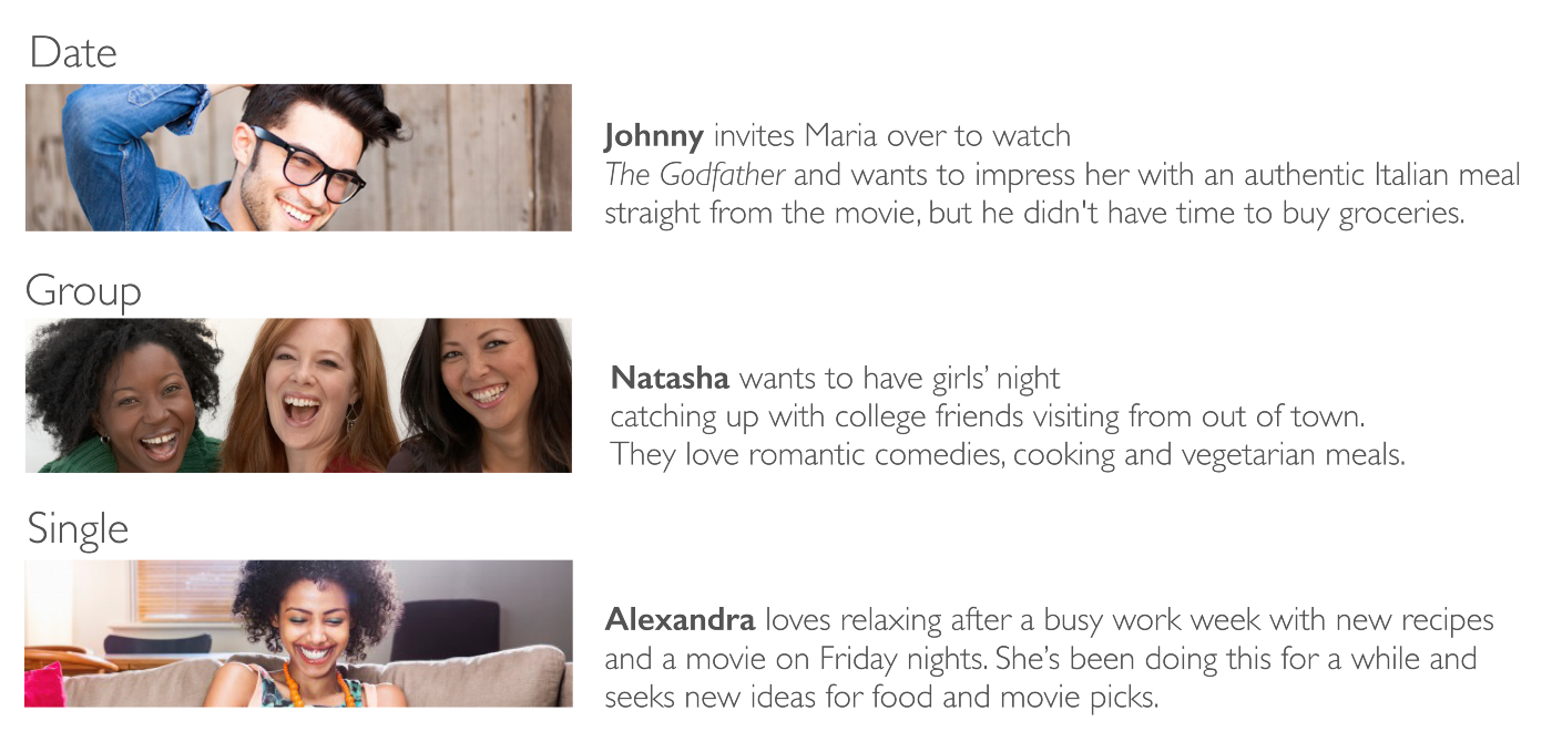
Using Johnny’s persona, we created a user flow using his task of finding the perfect movie meal combination. He wants to see a film in the drama genre but he is unsure which movies and what he wants to cook for his date.
Design
Swim Lane
Before brainstorming about different layout ideas onto wire frames, we did an swim lane flow to calculate the different navigation decisions a user would make going thru the app to have clearer picture of the design choices we need to make. Going thru the swim lane flow, we decided to put the login process near the end of the user journey, allowing the user to use the app even if they don’t make their online grocery purchases thru the app. From the user interviews data, we understood it would not be easy to get the get users to buy their groceries online. But if the experience of using this app was easy and fun, it would not just further the Fresh Direct brand but also bring the user back to use the app again.
Error Messaging
Creating the swim lane flow also allow us to accounts for the different errors states that can occur in the user journey and accounting for ways to get users back on track. Keeping with the fun movie theme of the app, we came up with error messages relating to famous movie quotes.

First Iteration

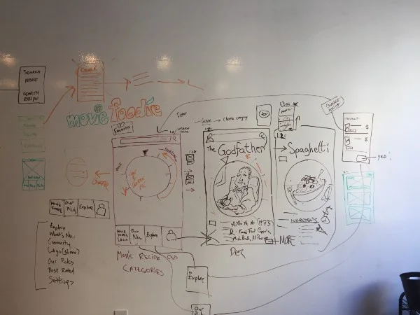
From our first design studio session, an idea for a dial as navigation element was conceptualized. All of three of us like the idea because it was maximized surface area while still organizing the immense amount of content from both the movie and recipe side. We went forward with the dial navigation and began making quick user flows for the Johnny persona and any user using the App for the first time. We soon discovered, however, that having a circular navigation posed readability issues with the various categories of film genres and food categories. We still wanted to have the circle as an UI element but we went on to the second iteration.
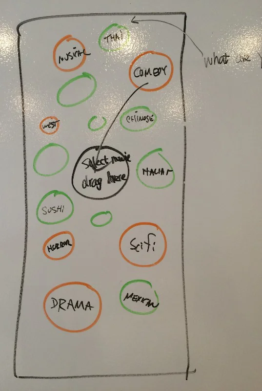
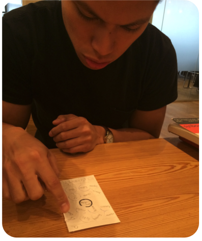
Second Iteration and Usability Testing
Keeping the circle element in the second iteration, we came up with a drag and drop system to allow the user to pick the movie genre they were interested in and also the category of food they want. With the readability issue from the first iteration we did some usability testing.
Usability Feedback:
•Feature in navigation tab is redundant
•Search categorized and error messaging
•Minor icon issue
•Add signer to make the content clear
While there was some wording issues with the content, the drag and drop navigation worked. the user experience also had to work too hard to get to the content pages. We wanted to present the content of the app on the first page for the undecided user. We went onto the third iteration.
Third Iteration and Wireframes
Undecided users would have to navigate through multiple pages to find content. An explore button was also created for user who are unsure of the movie they want to see and the food they wanted to eat.
Prototype
Presentation