Meetup is the world’s largest network of local groups. It brings together people with similar interests, either in a networking or social setting.
Time Frame: 2 Weeks
Tools: Google, Google Forms, Google Sheets, Trello, Omnigraffle, Sketch, Invision
My Role: UX Designer, Lead UI Designer, Interaction Designer, Project Manager
Platform: Desktop Website
Opportunity for Business Growth
While Meetup is incredibly effective for bringing people with similar interests together, it does not provide its user with resources for finding space rental to meet the specific needs of a meetup event. Users still have to painstakingly research different venues using outside resources. This presented an unique opportunity for our team; Allison Davies, Andy Lai and I. A new feature allowing existing users ways to communicate with potential space host and rent from potential space host, saving time and building on the sense of community that Meetup strives for. The two Meetup users group affected would be the organizers(the ones looking for space) and the host.
Research
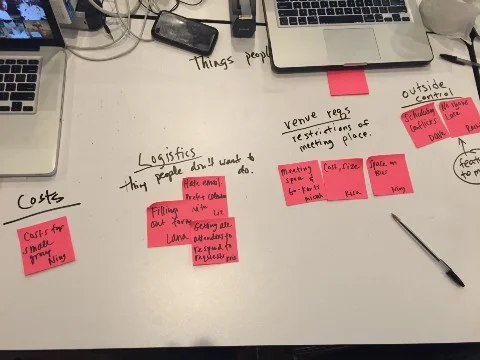
To understand how this new feature would benefit the two groups, surveys and user interviews were sent out. The topic map follows the behaviors and decisions an organizer goes through before renting a space.
Once we got a sense of the user needs, we began to recruit interview participants. Fifty-four respondents replied to our initial survey. From the Fifty-four respondents, we were able to conduct twelve organizer interviews and seven host interviews. Users with no experience organizing were filtered out immediately. We were also looking for interviewees with experience hosting a space. Finding interviewees for the host user proved far more challenging than finding the organizer user. A wider net was cast for our host interviews, including a commissary kitchen space owner as one of our interviewees.
“word of mouth is greatly helpful in organizing events.” — Anna K.
“having a code of conduct is important for all attendees.” — Luke M.
Contextual Inquiry
We attended a UX meetup event and spoke to the event organizers about the logistics of a typical Meetup event. There were two point persons at the event, one in charge of attendees and one in charge of finding the space. Laura, the point person for finding the space, mentioned the event's turnouts have increased. Therefore, there was a need to look for a larger space. But being that she is based out of LA, it was difficult for her to look at new spaces so they continued using the same space. Her pain points were similar to the ones we heard in the user interviews.
Research Synthesis
Once we collected the data from the user interviews, we began to formulate the trends and pain points based on the interview answers. Our findings were:
Organizers
• Proximity of space (whether to their work,
public transportation, or home)
• Amenities of the space (A/V needs, tech needs, seating)
• The logistics of having to fill out repetitive forms
• Finding the right size of space for group
• Communication with renters
• Cost
Host
• Communications with renters
• Code of Conduct (dealing with “jerks”, security, large groups)
• One point person
A streamlined and no hassle experience was very important for all interviewees. Word of mouth was a key filtering process for organizers when looking for a space. One unexpected and interesting piece of information that was discovered talking to the host users were the importance for a code of conduct and dealing with different types of people at the events. Since my teammates and I have never hosted a space for large events, it never crossed our minds how important that would be.
In addition to our interviews, we conducted a comparative analysis of multiple space renting sites. While no site fit the unique model of this feature, sites like hostels.com, airbnb.com. kidandcoe.com, did have a space rental feature on their site. We looked at how each site addressed amenities information, how they incorporated a wishlist, how the calendar was set up, as well as the prominence of their location maps.
Personas
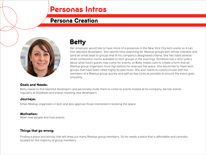
Through research synthesis, we created three personas. Two of the personas were organizers, Teddy and Dwight. The third persona was Betty, a host.
Design
We conducted feature prioritization brainstorming sessions to analyze the features that would be most important to the user. Many organizers express the difficulties of researching for a space that met the needs of their specific events. Pictures, searching by location, a detailed amenities list, and direct messaging capabilities between organizers and hosts were top priority. A rating and feedback system for both renters and space hosts were also crucial. A virtual tour feature was one of the first ones to go on the “nice to have but wont happen” pile. With scrolling pictures, the virtual tour was a bit redundant and a clunky feature.
Our team conducted multiple design studios to see which layout would incorporate the features that met the user needs while maintaining the Meetup brand.
Because of project time constraint, a few features that we wanted were eliminated.
• Notification to phone for space availability
• 3rd party payment service
• A detailed floor plan
• Request sponsorship to alleviate cost
Wire frames
Before implementing our layout ideas onto wire frames, we did an organizer user flow and a host user flow to calculate the different navigation decision each user would have to make before completing their task.
User Flows:
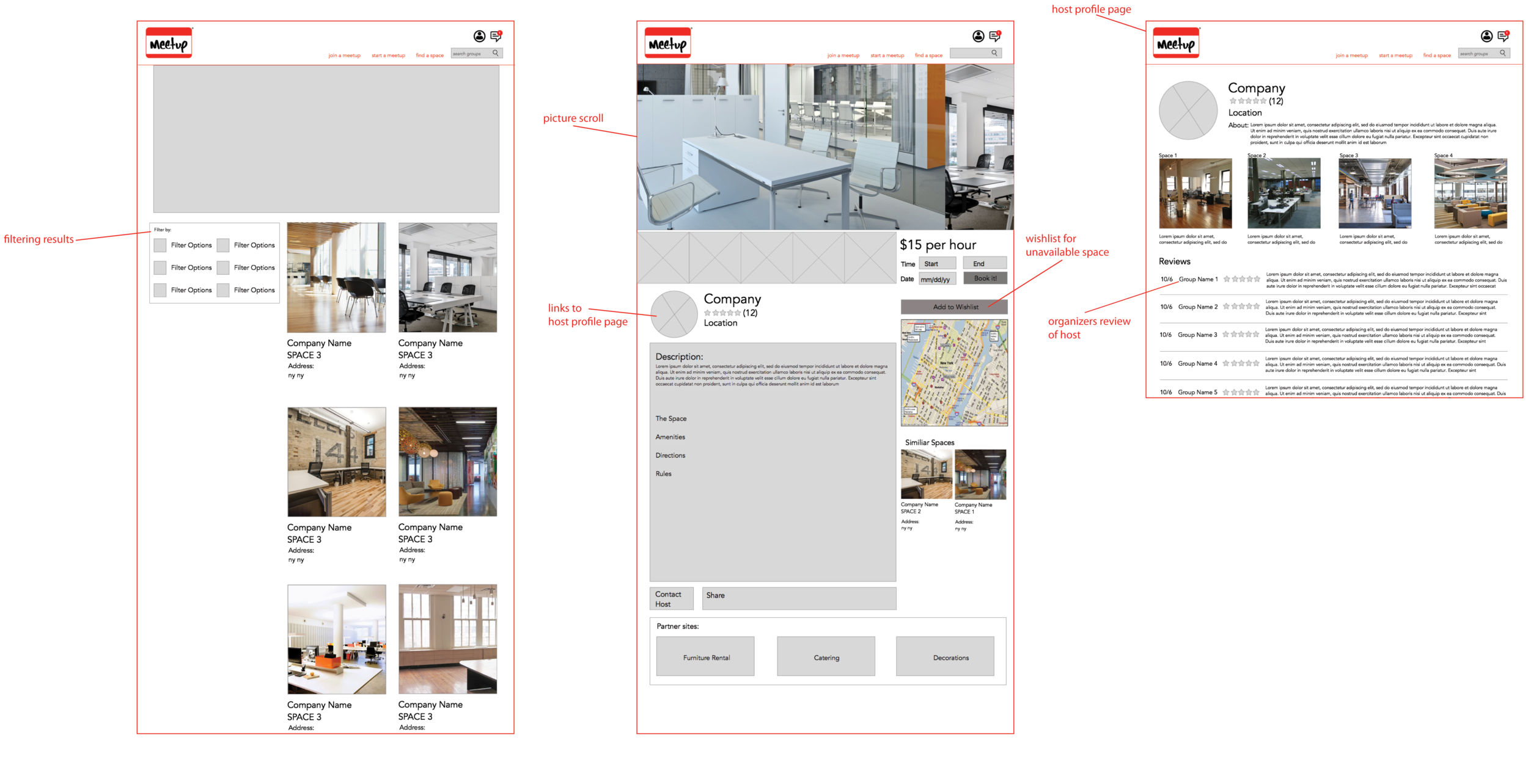
Error states and ways to get back on track were implemented in the user flow to prevent the user from being discouraged during their user journey. The filter feature on the search page allows users to quickly trim rental spaces that do not fulfill their amenities needs. Features like host profiles, organizer profiles, rating systems all help to build on the sense of networking and organizing within the Meetup community.
Prototype
Above is the annotated mid-fidelity prototype, detailing the implementation of the features from the design studio.
Usability Testing
Three tasks were giving to nine users: five as organizers and four as hosts.
Task 1: Finding and renting a space.
Task 2: Reviewing a user profile and replying to inquiry about available spaces.
Task 3: Completing a task following an error state.
The biggest finding from the usability testing was on the search page. Users found the large gray area that was the map and the lack of a header confusing. We also had users complete an error state task, recovering from a search error. Users thought the error message could be trimmed down. The word address in the search bar created confusion.
On the next iteration, we implemented an actual image of a map in the next iteration and also a search header. We trimmed down the error message in the search error page along with changing the word address to where in order to minimize any confusion.


